Read the model answer again and find:
----- Nội dung dịch tự động từ ảnh -----
13
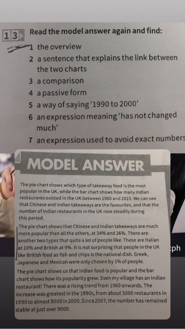
Read the model answer again and find:
the overview
2 a sentence that explains the link between
the two charts
3. a comparison
4 a passive form
5 a way of saying '1990 to 2000'
6 an expression meaning 'has not changed
much'
7 an expression used to avoid exact numbers
MODEL ANSWER
The pie chart shows which type of takeaway food is the most
popular in the UK, while the bar chart shows how many Indian
restaurants existed in the UK between 1960 and 2015. We can see
that Chinese and Indian takeaways are the favourites, and that the
number of Indian restaurants in the UK rose steadily during
this period.
The pie chart shows that Chinese and Indian takeaways are much
more popular than all the others, at 34% and 26%. There are
another two types that quite a lot of people like. These are Italian
at 10% and British at 9%. It is not surprising that people in the UK
like British food as fish and chips is the national dish. Greek,
Japanese and Mexican were only chosen by 1% of people.
The pie chart shows us that Indian food is popular and the bar
chart shows how its popularity grew. Even my village has an Indian
restaurant! There was a rising trend from 1960 onwards. The
increase was greatest in the 1990s, from about 5000 restaurants in
1990 to almost 8000 in 2000. Since 2007, the number has remained
stable at just over 9000.
ph
13
Read the model answer again and find:
the overview
2 a sentence that explains the link between
the two charts
3. a comparison
4 a passive form
5 a way of saying '1990 to 2000'
6 an expression meaning 'has not changed
much'
7 an expression used to avoid exact numbers
MODEL ANSWER
The pie chart shows which type of takeaway food is the most
popular in the UK, while the bar chart shows how many Indian
restaurants existed in the UK between 1960 and 2015. We can see
that Chinese and Indian takeaways are the favourites, and that the
number of Indian restaurants in the UK rose steadily during
this period.
The pie chart shows that Chinese and Indian takeaways are much
more popular than all the others, at 34% and 26%. There are
another two types that quite a lot of people like. These are Italian
at 10% and British at 9%. It is not surprising that people in the UK
like British food as fish and chips is the national dish. Greek,
Japanese and Mexican were only chosen by 1% of people.
The pie chart shows us that Indian food is popular and the bar
chart shows how its popularity grew. Even my village has an Indian
restaurant! There was a rising trend from 1960 onwards. The
increase was greatest in the 1990s, from about 5000 restaurants in
1990 to almost 8000 in 2000. Since 2007, the number has remained
stable at just over 9000.
ph