Tìm thấy 32.417 kết quả

Thời gian Nội dung Điểm thực lực Điểm cảm ơn
13/01/2025 19:45:57 <p>Sample 1:</p><p>The bar charts illustrate the distribution of the labour force in four different countries across agricultural, industrial, and service industries in two separate years.</p><p>Overall, Germany, the USA, and Japan had very similar workforce distribution trends, compared with China. In addition, the industrial sector accounted for the highest proportion of jobs in all countries besides China, in both years.</p><p>In 1980, 60% of the German workforce were employed in the industrial sector, compared to around 50% in Japan and the USA, and 40% in China. Meanwhile, approximately half of the German, US, and Chinese workforce worked in service industries, followed by Japan, with a figure of nearly 40%. Agricultural jobs, on the other hand, dominated the Chinese labour market, accounting for 70% of the workforce, while figures for the other three countries ranged between 5 and 10%.</p><p>By 2010, the German and Japanese industrial sectors had witnessed increases, making up 80% of their workforces, which was about 10% more than the figure for the USA, and double that of China. In contrast, a downward trend could be seen in the percentage of the workforce in the service industry, with Germany and the USA sitting at 40%, and Japan and China at 30% and 20% respectively. Jobs in the agricultural sector also saw a significant decline in all countries, with China dropping to 50%, and Germany declining to almost 1%.</p><p>Sample 2:</p><p>The bar charts depict the proportion of individuals employed in three different sectors across four countries in two years, 1980 and 2010.</p><p>Overall, there was a decline in the percentage of employment in agriculture and services, while industry in all countries generally experienced an upward trend except for China. In both years, agriculture held the highest percentage of employment in China, while industry dominated in the other nations.</p><p>In 1980, the workforce distribution in Germany showed that 60% of individuals were employed in industry, with services and agriculture accounting for 50% and 5% respectively. Similarly, the USA and India had comparable distribution patterns, with roughly half of the workforce employed in industry and a small minority in agriculture. Conversely, China had a predominant agricultural workforce, at 70%, surpassing services and industry by 20% and 30% respectively.</p><p>Thirty years later, there was a notable increase in industry in Germany, the US, and Japan, ranging from 70% to 80%, while China's industry sector remained relatively stable at 40%. There was a significant decrease of 30% in services in China, compared to a less significant drop of approximately 10% in the other countries. This trend also applied to agriculture, with China experiencing a decline of 20%, while the figures for the other three countries remained negligible, accounting for less than 10%.</p><p>Sample 3:</p><p>The bar charts illustrate the employment distribution across sectors in four nations between 1980 and 2010.</p><p>Overall, there was a downturn in agricultural and service employment, while industrial employment generally surged across all countries except China. In China, agriculture maintained the highest employment share in both years, while industry dominated in the other countries.</p><p>In 1980, Germany exhibited a predominant industrial workforce at 60%, with services and agriculture at 50% and 5% respectively. Similarly, the USA and India had comparable patterns, with roughly half in industry and nearly another half in services and a small minority in agriculture. In contrast, China’s workforce was primarily agricultural, at 70%, exceeding services and industry by 20% and 30% respectively.</p><p>By 2010, there was a surge in industrial employment in Germany, the US, and Japan, reaching 70% to 80%, while China’s industrial sector remained stable at 40%. China experienced a notable 30% decline in services, compared to around 10% in the other countries. Agricultural employment in China also dropped by 20%, contrasting with negligible changes in the other nations, each accounting for less than 10%.</p><p>Sample 4:</p><p>The bar charts illustrate the percentage of workers in three sectors - agriculture, industry, and services - across four countries (Germany, USA, Japan, and China) in 1980 and 2010.</p><p>Overall, the period saw a shift towards services, with agriculture and industry declining across all four countries.</p><p>In 1980, agriculture had the highest workforce in China, accounting for around 70%, while the USA, Japan, and Germany had significantly lower percentages at about 3%, 4%, and 6% respectively. Industry was prominent in Germany with 40%, followed by Japan and the USA with roughly 30%. Services dominated the USA at 50%, and were also significant in Japan and Germany, with 45% and 40% respectively.</p><p>By 2010, the workforce distribution changed notably. In China, agriculture's share fell to about 35%, while services rose to 45%. Germany saw a rise in services to 70%, with industry dropping to 25% and agriculture remaining low. Similarly, the services sector in the USA and Japan increased to approximately 70% and 60%, respectively, with declines in agriculture and industry in both countries.</p><p>Sample 5:</p><p>The bar charts depict the proportion of workers employed in agriculture, industry, and services in Germany, the USA, Japan, and China in 1980 and 2010.</p><p>Overall, industry and services were the primary sectors attracting workers in most countries, except for China, where agriculture employed the largest workforce. While the proportion of agricultural workers decreased in all four countries between 1980 and 2010, the number of workers in the industrial sector increased in all countries excluding China.</p><p>In 1980, Germany had over 50% of its workforce engaged in industry, with services closely following at 50%. By 2010, the industrial sector in Germany continued to grow, reaching 80%, an increase of 20% from the initial data. A similar pattern was observed in the USA, where industry and services remained dominant, with minimal representation in agriculture.</p><p>Japan, in 1980, had half of its workforce in the industrial sector, which increased to nearly 80% by 2010. The percentage of individuals in services decreased from 40% to around 30%, while agriculture had a negligible presence. China stood out as the only country where agriculture accounted for the majority of its workforce at 70% in 1980. Over the next three decades, the proportion of Chinese individuals in industry remained stable, while agriculture and services experienced significant declines to 50% and 20%, respectively.</p><p>Sample 6:</p><p>The bar charts give information about the proportion of individuals who got a job in three different sectors across four countries in two separate years, namely 1980 and 2010.</p><p>Overall, declining trends were seen in the percentage of workers in agriculture and services, while industry in all countries generally experienced rising trends, with the exception of China. It is also noticeable that in both years, agriculture accounted for the highest proportion of employment in China, while industry dominated in the other nations.</p><p>In 1980, 60% of the workforce in Germany was made up of industrial workers, while the figures for services were marginally lower, at 50%, and only 5% worked in the agricultural sector. Similar distribution patterns can be seen in the USA and India, where roughly half of the workforce were employed in industry and agricultural workers made up a small proportion. By contrast, China was the leading country in terms of employees holding agricultural jobs, at a striking 70%, in contrast to slightly under 50% and 40% for services and industry respectively.</p><p>Over the following 30 years, there was a marked increase in the percentage of people working in the industrial field in Germany, the US, and Japan, with figures ranging from 70% to 80%, while China’s industry sector remained relatively constant at 40%. The most significant decrease of 30% in services was recorded in China, whereas the corresponding figures for the remaining countries dropped by a lesser amount (around 10%). Finally, the agricultural sector experienced a similar pattern to that of services, with China again experiencing the most noticeable decline of 20%, while the figures for the other three countries remained relatively low, making up less than 10%.</p><p>Sample 7:</p><p>The bar charts give information about the proportion of individuals who got a job in three different sectors across four countries in two separate years, namely 1980 and 2010.</p><p>Overall, there were decreasing trends in the proportion of workers in agriculture and services, while industry generally saw an upward trend across all countries except China. It is noteworthy that agriculture constituted the largest share of employment in China in both years, whereas industry dominated in other nations.</p><p>In 1980, Germany had 60% of its workforce in industry, slightly lower figures for services at 50%, and only 5% in agriculture. Similar distribution patterns were observed in the USA and India, where around half of the workforce was in industry, and agriculture had a smaller share. In contrast, China stood out with 70% of its workforce in agriculture, compared to just under 50% in services and 40% in industry.</p><p>Over the next three decades, there was a significant rise in the proportion of industrial workers in Germany, the US, and Japan, ranging from 70% to 80%, while China's industrial sector remained relatively stable at 40%. China also saw the most substantial decrease of 30% in the services sector, whereas the other countries experienced smaller declines (around 10%). The agricultural sector followed a similar pattern to services, with China again showing the largest decline of 20%, while the other countries remained below 10%.</p>
13/01/2025 19:53:48 <p>Sample 1:</p><p>The provided line graph illustrates the changes in number of cars British people owned from 1995 to 2005.</p><p>It is noticeable that more people owned cars over the period shown. Additionally, the figure for people with 1 car was consistently highest while the opposite was true for people with 3 cars.</p><p>In 1975, 45% of people in the UK owned a single car while the percentage of those with no car was 2% lower, at 43%. Over the following decade, these figures both decreased, with one-car ownership down to 38% and no-car ownership to 25%. While the proportion for British people owning 1 car steadily increased and reached its exact number in 1975 at 45%, the figure for people with no car gradually went down to only 22%.</p><p>The percentage of people with 2 and 3 cars experienced a similar pattern over the given period. The figure for people owning 2 cars stood at 7% in 1975, which was 4% higher compared to that for people owning 3 cars. They both increased steadily and reached their highs of 18% (people with 2 cars) and 4% (people with 3 cars).</p><p>Sample 2:</p><p>The line graph delineates car ownership trends among UK residents, detailing the percentages of households with no cars up to those owning three cars, over three decades starting from 1975.</p><p>Overall, there was a significant rise in car ownership during this period, with the number of households owning one car consistently higher than other categories, while the opposite was true for those owning three cars.</p><p>In 1975, 45% of households owned a single car, slightly surpassing 43% of households without any car. Over the next decade, both categories experienced a decrease, with single-car ownership falling to approximately 38% and no-car ownership sharply dropping to one quarter. However, from 1985 onwards, the figures for the former recovered and returned to the initial 1975 level of 45%, while those for the latter continued their decline, reaching roughly 22% by 2005.</p><p>The most substantial growth was observed in households owning two cars, which increased steadily from about 7% in 1975 to around 18% in 2005. The proportion of households with three cars also increased, although it remained the smallest group. This category grew from a nearly negligible percentage in 1975 to approximately 7% in 2005.</p><p>Sample 3:</p><p>The line graph shows how car ownership in the UK changed between 1975 and 2005.</p><p>Overall, the proportion of people who owned two or three cars rose while the figure for those who owned no car declined. Additionally, having one car was the most common situation during the period shown.</p><p>In 1975, nearly half of the UK population had one car while people with no car took up a smaller percentage, at roughly 43%. These figures both declined over the following ten years, to around 37% for people who have one car and 25% for those with no car. The percentage of those who owned 2 or 3 cars was approximately 7% and 3% respectively in 1975, and both experienced increases over the next 10 years to around 13% and 5% respectively.</p><p>Over the next 20 years, the percentage of those with one car gradually rose back up to 45% whereas the percentage of those with no car continued to decline to about 22%.</p><p>On the other hand, the proportion of people having 2 or 3 cars continued to rise over the following 20 years to 19% and 9% respectively.</p><p>Sample 4:</p><p>The line graph illustrates the percentage of car ownership in the UK over a 30-year period, from 1975 to 2005. The data is divided into four categories: people owning 1 car, 2 cars, 3 cars, and no car.</p><p>Overall, there was a clear increase in the number of people owning one or three cars, while those without a car or with two cars experienced a decline over the period.</p><p>In 1975, the majority of UK citizens owned either one or two cars, with 43% of the population having 1 car and approximately 38% owning 2 cars. Over the next three decades, the figure for 1-car households rose steadily, peaking at about 47% in 2005. Conversely, the percentage of those with two cars fell significantly to around 27% in the same year.</p><p>Meanwhile, the proportion of people with no car or three cars started at a lower base. In 1975, roughly 8% of households had no car, and around 4% owned 3 cars. Over the years, the share of non-car owners steadily decreased to about 5%, whereas the percentage of those owning 3 cars saw a moderate rise to 12% by 2005.</p><p>Sample 5:</p><p>The chart below gives information about car ownership in the UK from 1975 to 2005.</p><p>Overall, the trend indicates a shift towards increased car ownership over the 30-year period, with a notable rise in the number of individuals owning at least one car.</p><p>In 1975, 45% of individuals in the UK possessed a single car, slightly surpassing the percentage of those with no car, which stood at 43%. In the subsequent decade, both percentages declined, with single-car ownership decreasing to 38% and no-car ownership to 25%. While the percentage of individuals owning one car steadily rose to match its initial 1975 number of 45%, the figure for individuals with no car gradually decreased to 22%.</p><p>The proportions of individuals owning two and three cars exhibited a similar trend during the period provided. In 1975, 7% of individuals possessed two cars, which was 4% higher than those owning three cars. Both categories increased steadily, reaching their peaks at 18% (individuals with two cars) and 4% (individuals with three cars).</p><p>Sample 6:</p><p>The line graph details the changes in car ownership in the UK between 1975 and 2005.</p><p>Looking at the graph from an overall perspective, it can be seen that most UK residents had only one car. Also, more and more people possessed 2 or 3 cars over the surveyed period, which resulted in a corresponding drop in the figure for people who owned no car.</p><p>In 1975, 43% of the UK population had no car at all, approximately close to that of one-car owner at 45%. These figures far exceeded those of two-car and three car owners with 7% and 3% respectively. 10 years later, both percentages of one-car owners and people who had no car saw a precipitous decline of 7% and a dramatic 18% in turn. From this point, the former started to recover back to 45% in 2005, whilst the latter continued to drop slightly and reach a low of 22% at the end of the period. Both figures for owners of two cars and three cars enjoyed steady growth, amounting to 18% and 9% in 2005.</p><p>Sample 7:</p><p>The line graph illustrates changes in car ownership in the UK over a 30-year period from 1975 to 2005. The graph indicates a significant shift towards increased car ownership in UK households, with a particular rise in those owning two or more vehicles.</p><p>Initially, the most common category in 1975 was households with one car, accounting for approximately 43% of the total. This figure, however, experienced a gradual decline over the 30 years, finishing at just under 40% in 2005. In contrast, the proportion of two-car households saw a steady increase from around 25% to surpass the 35% mark by the end of the period, indicating a significant shift in car ownership patterns.</p><p>The percentage of households without a car is not provided, yet there is a notable change in the trends of three and four-car households. In 1975, these were the least common, with three-car households making up around 7% and four-car households negligible at 2%. Over time, both categories saw a marked increase, with the percentage of three-car households rising to approximately 17%, while that of four-car households climbed to about 5% in 2005.</p><p>This trend suggests a clear move towards higher car ownership in the UK, with a particularly sharp rise in households owning two or more cars. By 2005, the number of households with two cars was nearly equal to those with one car, a considerable change from the situation in 1975.</p><p>Sample 8:</p><p>The line graph depicts the evolution of automobile ownership in the UK between 1975 and 2005.</p><p>Overall, the percentage of individuals who own two or three automobiles increased, while the percentage of persons who do not own a car decreased.</p><p>In 1975, fewer than 5% of households had two automobiles. It grew by around 5% after ten years. From 1995 to 2005, the percentage of households driving their own automobile increased gradually, from roughly 6% to 10%. This was the equivalent of three new automobile owners. Between 1975 and 2005, the numbers increased by around 8% to 14%, 15%, and nearly 20%.</p><p>About 45 percent of the population did not own an automobile. However, in 1985 this proportion</p><p>dropped substantially, from around 24%. In 2005, 45 percent of automobile owners had only one vehicle.</p>
13/01/2025 19:52:20 <p>Sample 1:</p><p>The bar charts illustrate the proportion of food and other products purchased from supermarkets in three European countries in two separate years, namely 1998 and 2008.</p><p>Overall, there was a clear upward trend in supermarket sales across all countries, regardless of the type of products. Notably, although Country B had the highest percentage of food and goods bought from supermarkets in 1998, Country A had surpassed it by 2008.</p><p>In terms of food sales, Country B purchased around 23% of its food from supermarkets in the first year, followed by a modest rise of 5% over the next decade. In contrast, Country A experienced a sharper increase, with supermarket food purchases rising from 10% in 1998 to 35% in 2008, exceeding Country B. At the same time, Country C's food sales remained the lowest, making up less than 10% in both years, even though there was a small rise.</p><p>Other goods followed a similar trend. In 1998, Country B was at the forefront, with nearly 25% of supermarket sales, which was more than five times the amount for Country A. Yet by 2008, Country A had risen significantly, reaching almost 40%, surpassing the slower growth in Country B to about 27%. Meanwhile, Country C consistently had the lowest figures, growing from just over 2% in 1998 to almost 15% in 2008.</p><p>Sample 2:</p><p>The bar charts illustrate the percentage of food and other goods purchased from supermarkets in three European countries – A, B and C – in the years 1998 and 2008.</p><p>Overall, there was a significant increase in supermarket purchases in all three countries over the 10-year period. However, the extent of this increase varied between the countries, with Country A showing the most notable changes.</p><p>In terms of food purchases, Country A, which had the second-highest percentage at 10% in 1998, experienced a dramatic increase to 35% in 2008, making it the highest in that year. Country B, starting with the highest percentage of 23% in 1998, saw a smaller rise to 27% by 2008, ranking second. Meanwhile, Country C exhibited a modest increase from 6% to 8%, maintaining the lowest percentage of food purchases in both years.</p><p>Regarding the percentage of goods bought in supermarkets, a similar trend can be observed. In 1998, Country B had the highest proportion at just under 24%, compared to the minor figures in Country A (4%) and Country C (1%). By 2008, Country B increased only slightly by 2%, ranking second. Country A, however, saw the most dramatic rise, soaring to 38%, becoming the highest. Country C also climbed significantly to just under 15%, although it still remained the lowest among the three countries.</p><p>Sample 3:</p><p>The given bar graphs compare the proportions of groceries and other products purchased from supermarkets across three European nations between 1998 and 2008.</p><p>Overall, sales saw an upward trend in all the countries presented, with the most notable increase occurring in Country A. Another noteworthy feature is that in 1998, Country B led in supermarket sales; however, a decade later, Country A surpassed all other nations to take the top position.</p><p>Looking first at food purchases, in 1998, the percentage of groceries bought at supermarkets in Country B accounted for 23%, which was 13% higher than that in Country A and four times greater than Country C's figure.</p><p>Over the next decade, the figure for Country A experienced a significant surge, reaching 35% and becoming the leader in food sales. In contrast, minimal growth was observed in other nations during the same period, with increases of just under 5%.</p><p>Regarding sales of other goods, Country A, initially in second place, saw a sharp rise to 40% in the percentage of goods sold and overcame Country B to be the leader in this category. Likewise, Country C followed a comparable trajectory, increasing sevenfold to reach 14%, though it remained the nation with the lowest sales. Despite having the highest starting point of 24%, the growth in goods sales of Country B was slower, rising modestly to just over a quarter.</p><p>Sample 4:</p><p>The given bar charts compare three European countries in terms of the percentage of food and other products purchased from supermarkets between 1998 and 2008.</p><p>Overall, supermarket sales experienced a marked upward trend in all countries, irrespective of the type of products. It is also evident that while the proportion of both food and goods purchased in supermarkets in Country B was the highest in 1998, by 2008 it had been overtaken by Country A.</p><p>Regarding food sales, in 1998, individuals in Country B, on average, bought approximately 23% of their food from supermarkets, after which this figure increased modestly by 5% over the following decade. A similar trend, though more pronounced, was observed in Country A, where supermarket food sales surged from 10% to 35%, surpassing Country B. Meanwhile, food purchases in Country C remained relatively low, accounting for less than 10% in both years, despite a slight increase.</p><p>A comparable pattern emerged in the sale of goods. Country B initially led in 1998, with nearly 25% of goods purchased from supermarkets, quintuple the figure for Country A. However, by 2008, Country A saw an eightfold increase, reaching nearly 40%, thus surpassing the more modest rise to around 27% in Country B. Country C consistently registered the lowest proportion of goods bought in supermarkets, with figures increasing from just over 2% to nearly 15%.</p><p>Sample 5:</p><p>The given bar chart illustrates the rising dominance of supermarkets regarding food and goods purpchases across three European countries between 1998 and 2008.</p><p>Overall, it is clear that supermarkets had progressively gained a higher market share in selling food and goods across all 3 examined nations, despite to varying extents. Specifically, supermarkets were most prevalent among consumers in country 1, while country 3 displayed the lowest level of supermarket reliance.</p><p>With regards to food, 10% of food bought in country 1 was from supermarkets, which then increased remarkably to a staggering 40% 10 years later, registering as the highest figure across the chart. Country 2 followed a similar pattern, rising moderately from around 25% to over 30% in the same time period. By contrast, country 3 showcased the least interest in buying from supermarkets, witnessing only modest growth from about 5% to over 10% in the examined years.</p><p>As for goods, supermarkets once again displayed dominance in country 1, owning about 20% of the market in 1998, before rising to nearly 60% by 2008. Similarly, country 2 recorded a significant climb in its supermarket share, growing from approximately 40% to about 50% after 10 years. Finally, a neligible 3% was seen in the corresponding figure for country C in 1998, which grew to about 10% by 2008, reflecting a minimal shift in consumer preference toward supermarkets.</p>
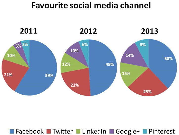
13/01/2025 19:52:41 <p>Sample 1:</p><p>The pie charts show users’ preference on social media channels throughout the 3-year period, from 2011 until 2013. Overall, Facebook was the most favorable social media channel for three consecutive years despite a gradual fall from one year to another.</p><p>Facebook started with the largest number of 59% users in 2011, and the figure began to drop slightly by 10% in the following year. In 2013, only 38% of respondents agreed that they like Facebook better than other social media platforms. Twitter ranked just below Facebook with a huge gap in 2011, which was narrowed from year to year as the percentage of Twitter’s fans consistently increased from 21% to 25%.</p><p>A similar pattern can be seen in the rest of social media channels. LinkedIn continued to attract more people and achieved 15% enthusiasts in 2013. Google+ and Pinterest shared the same percentage in 2011 at only 5%; However, while Pinterest showed a minimal change of only 3%, the figure for Google+ nearly tripled to 14%, becoming the social media with the most significant increase among the five.</p><p>Sample 2:</p><p>The charts depict user preferences across various social media platforms from 2011 to 2013. Throughout this period, Facebook maintained its status as the top choice, despite experiencing a gradual decline in popularity each year. Initially, in 2011, Facebook garnered the highest percentage at 59%, which decreased to 49% in 2012 and further dropped to 38% by 2013.</p><p>In contrast, Twitter consistently gained traction over the three-year span, albeit with a noticeable gap behind Facebook. Starting at 21% in 2011, Twitter’s popularity steadily rose to 25% by 2013.</p><p>Similar trends were observed with other platforms. LinkedIn witnessed a continuous increase in users, reaching 15% by 2013. Google+ and Pinterest, both starting at 5% in 2011, experienced divergent trajectories. While Pinterest’s popularity saw a slight rise to 8% by 2013, Google+ underwent a significant surge, nearly tripling to 14%, marking the most substantial growth among the platforms analyzed.</p><p>Sample 3:</p><p>The provided pie charts compare the percentages of 5 different popular social media platforms namely Facebook, Twitter, LinkedIn, Google+ and Pinterest in three consecutive years from 2011 to 2013.</p><p>It can be seen that Facebook remained the leading social media platform; however, its user base decreased over the three-year period. Meanwhile, the platforms saw increases in their user percentages, reflecting shifting preferences among social media users</p><p>In 2011, Facebook accounted for more than half of the users, followed by Twitter with approximately one-fifth of the total. In the following years, Facebook's percentage dropped slightly by 2% before reaching 38% by the end of the period. In contrast, Twitter saw a rise in popularity, with increases of 2% and 3% in 2012 and 2013, respectively.</p><p>On the other hand, other social media platforms were significantly less popular, since all of them collectively accounted for only 20% of the total in 2011, with Linkedin users doubling that of Google+ and Pinterest supporters. However, they experienced an upward trend in the next two years following the decline of Facebook users, with Google+ having the most dramatic surge of 9% in total.</p>
13/01/2025 19:51:50 Exchange students from universities in ...
13/01/2025 19:47:44

In 2008, the pie chart delineates that work and study were the most prominent reasons for migration, accounting for 38% and 32% of all immigrants, respectively, while accompanying or joining the family constituted only 16%. Finally, unlisted reasons and non-respondents both comprised 7% each.

Sample 2:

The graphs present data on migration to the UK. The pie chart demonstrates the purposes for migration in 2008, while the line chart indicates the duration of expected stays from 2000 to 2008.

Overall, the line graph reveals that the majority of immigrants expected to stay in the UK for no more than two years. According to the pie chart, work was the key cause of migration in 2008.

In 2000, the number of immigrants in the “up to 2 years” and “4 or more years” categories were equal at 150 thousand. However, in 2001, the number of immigrants intending to migrate for up to 2 years considerably increased, peaking at 250 thousand in 2004. Meanwhile, the amount of people planning to resettle for 4 or more years remained relatively stable, hovering about 150 thousand. Also, between 50 and 100 thousand immigrants are expected to stay for 2 to 4 years throughout the period.

The pie chart reveals that 38% of all immigrants came for work, making it the most prominent factor. Study ranked second, accounting for 32% of all immigrants, followed by accompany/join family at 16%. Other reasons and those who did not respond both made up 7% of the total.

Sample 3:

The two illustrations provide insights into immigration trends in the UK between 2000 and 2008, focusing on duration of stay and motivation for relocation.

The data reveals that short-term stays, up to two years, were the most prevalent, with job opportunities being the predominant reason for moving.

Looking closely at the graph, it is evident that short-term immigrants constituted the largest segment. Initially, this group was around 150,000 strong in 2000, swelling steadily to peak at 250,000 by 2004, with this figure remaining static until 2008. In contrast, immigrants intending to stay for four years or longer maintained a consistent population of 150,000 throughout the period. Meanwhile, a smaller group, planning a two to four-year stay, showed the modest growth from 50,000 in 2000 to 100,000 in 2008.

Switching to the chart, it is clear that employment opportunities were the primary draw for migrants, accounting for 38% of the total. This was 6% higher than those immigrating for education. Family reunification prompted 16% of migrations, with the remaining 14% split evenly between unspecified reasons and other causes.

Sample 4:

The pair of depictions offer an in-depth look at immigration patterns in the United Kingdom from the start of the millennium until 2008, cantering on the length of stay and the impetus for making the move.

An analysis of the data divulges that transitory residences, not surpassing a two-year span, held the majority, with vocational prospects emerging as the chief rationale for relocation.

Upon examining the information about migration to the UK, it's apparent that transient immigrants comprised the largest demographic. Initially, this contingent held a strength of approximately 150,000 in the year 2000, experiencing a steady augmentation to reach its zenith at 250,000 by 2004. Intriguingly, this number remained constant until the end of the recorded period in 2008. In stark opposition, immigrants harbouring intentions to establish a home for a period of four years or beyond maintained a persistent count of 150,000 over the course of the observed timeline. Conversely, a minority group, envisioning a stay extending from two to four years, demonstrated a moderate escalation from 50,000 in 2000 to 100,000 by 2008.

Shifting attention to the pie-chart, it becomes unequivocally evident that the lure of employment opportunities served as the paramount magnet for migrants, accounting for a notable 38% of the entire pool. This was a full 6% greater than those electing to immigrate for academic advancement. The motive of family reunification spurred 16% of these translocations, leaving the remaining 14% to be equally distributed between undetermined reasons and various other triggers.

" alt="

Sample 1:

The line graph represents immigrants' intended duration of stay in the UK from 2000 to 2008. The pie chart demonstrates the reasons behind migration to the UK in 2008.

In general, most immigrants planned to reside in the UK for a maximum of two years. In addition, work was the primary reason for migration to the UK in 2008.

In 2000, most immigrants aimed to reside in the UK for "up to 2 years" and "4 or more years" (both categories were around 150,000). The following years saw a substantial increase in the former category, peaking in 2004 (at roughly 250,000). In contrast, those intending to reside for four or more years had a stable figure throughout the period, fluctuating around 150,000. Lastly, in the same time frame, the number of immigrants planning to stay for 2 to 4 years ranged between 50,000 to 60,000, with a significant jump to 100,000 in 2008.

In 2008, the pie chart delineates that work and study were the most prominent reasons for migration, accounting for 38% and 32% of all immigrants, respectively, while accompanying or joining the family constituted only 16%. Finally, unlisted reasons and non-respondents both comprised 7% each.

Sample 2:

The graphs present data on migration to the UK. The pie chart demonstrates the purposes for migration in 2008, while the line chart indicates the duration of expected stays from 2000 to 2008.

Overall, the line graph reveals that the majority of immigrants expected to stay in the UK for no more than two years. According to the pie chart, work was the key cause of migration in 2008.

In 2000, the number of immigrants in the “up to 2 years” and “4 or more years” categories were equal at 150 thousand. However, in 2001, the number of immigrants intending to migrate for up to 2 years considerably increased, peaking at 250 thousand in 2004. Meanwhile, the amount of people planning to resettle for 4 or more years remained relatively stable, hovering about 150 thousand. Also, between 50 and 100 thousand immigrants are expected to stay for 2 to 4 years throughout the period.

The pie chart reveals that 38% of all immigrants came for work, making it the most prominent factor. Study ranked second, accounting for 32% of all immigrants, followed by accompany/join family at 16%. Other reasons and those who did not respond both made up 7% of the total.

Sample 3:

The two illustrations provide insights into immigration trends in the UK between 2000 and 2008, focusing on duration of stay and motivation for relocation.

The data reveals that short-term stays, up to two years, were the most prevalent, with job opportunities being the predominant reason for moving.

Looking closely at the graph, it is evident that short-term immigrants constituted the largest segment. Initially, this group was around 150,000 strong in 2000, swelling steadily to peak at 250,000 by 2004, with this figure remaining static until 2008. In contrast, immigrants intending to stay for four years or longer maintained a consistent population of 150,000 throughout the period. Meanwhile, a smaller group, planning a two to four-year stay, showed the modest growth from 50,000 in 2000 to 100,000 in 2008.

Switching to the chart, it is clear that employment opportunities were the primary draw for migrants, accounting for 38% of the total. This was 6% higher than those immigrating for education. Family reunification prompted 16% of migrations, with the remaining 14% split evenly between unspecified reasons and other causes.

Sample 4:

The pair of depictions offer an in-depth look at immigration patterns in the United Kingdom from the start of the millennium until 2008, cantering on the length of stay and the impetus for making the move.

An analysis of the data divulges that transitory residences, not surpassing a two-year span, held the majority, with vocational prospects emerging as the chief rationale for relocation.

Upon examining the information about migration to the UK, it's apparent that transient immigrants comprised the largest demographic. Initially, this contingent held a strength of approximately 150,000 in the year 2000, experiencing a steady augmentation to reach its zenith at 250,000 by 2004. Intriguingly, this number remained constant until the end of the recorded period in 2008. In stark opposition, immigrants harbouring intentions to establish a home for a period of four years or beyond maintained a persistent count of 150,000 over the course of the observed timeline. Conversely, a minority group, envisioning a stay extending from two to four years, demonstrated a moderate escalation from 50,000 in 2000 to 100,000 by 2008.

Shifting attention to the pie-chart, it becomes unequivocally evident that the lure of employment opportunities served as the paramount magnet for migrants, accounting for a notable 38% of the entire pool. This was a full 6% greater than those electing to immigrate for academic advancement. The motive of family reunification spurred 16% of these translocations, leaving the remaining 14% to be equally distributed between undetermined reasons and various other triggers.

" src="https://cdn.lazi.vn/timthumb.php?src=storage/uploads/edu/answer/lazi_65779_1736762219.png&w=100" />

13/01/2025 19:53:00 <p>Hướng dẫn giải</p><p>Trả lời: −1</p><p>Ta có .</p><p>Suy ra . Do đó .</p>
13/01/2025 19:51:47 <p>Hướng dẫn giải</p><p>Trả lời: 2</p><p>Gọi</p><p>\(O = AC \cap BD\), \(H\) là trung điểm \(CD\). Trong \(\left( {SOH} \right)\), kẻ \(OI \bot SH\).</p><p>Có \(\left\{ \begin{array}{l}CD \bot SO\\CD \bot OH\end{array} \right. \Rightarrow CD \bot \left( {SOH} \right) \Rightarrow CD \bot OI\).</p><p>Mà \(OI \bot SH\) nên \(OI \bot \left( {SCD} \right)\) \( \Rightarrow d\left( {O,\left( {SCD} \right)} \right) = OI\).</p><p>Vì O là trung điểm BD nên \(d\left( {B,\left( {SCD} \right)} \right) = 2d\left( {O,\left( {SCD} \right)} \right) = 2OI = \frac{{\sqrt {S{O^2} + O{H^2}} }}\).</p><p>Có \(AD = AC\sin 45^\circ = \sqrt 6 \), \(OH = \frac{{\sqrt 6 }}{2}\) \( \Rightarrow d\left( {B,\left( {SCD} \right)} \right) = 2\).</p>
13/01/2025 19:48:22 Hướng dẫn giải a) Đ, b) S, c) S, d) Đ a) ...
13/01/2025 19:53:01 Hướng dẫn giảiGọi \(A\) là biến cố “Chọn ...