Bài tập  /  Bài đang cần trả lời

Tiếng Anh - Lớp 9
19/07 19:37:55

You should spend around 20 minutes on this section

CỨU
----- Nội dung dịch tự động từ ảnh -----
C. WRITING
You should spend around 20 minutes on this section.
The charts below show the percentages of the water used in different sectors in Sydney, Australia
in 1997 and 2007.
Summarize the information by selection and reporting the main features and make comparisons
where relevant.
Percentage of total water use: 1997
Percentage of total water use: 2007
Service industry
13%
Building
Building industry
5%
Building industry
2%
Service industry
Household use
19%
25%
Household use
21%
Food industry
48%
Manufacturing
15%
Food industry
41%
Manufacturing
11%
1 trả lời
Hỏi chi tiết
29
Tham khảo câu trả lời từ Trợ lý ảo Lazi
The pie charts illustrate the distribution of water usage across different sectors in Sydney, Australia, for the years 1997 and 2007.

In 1997, the food industry was the largest consumer of water, accounting for 48% of the total usage. This was followed by the manufacturing sector, which used 15% of the water. Household use and the service industry consumed 19% and 13% of the water, respectively. The building industry had the smallest share, using only 5% of the total water.

By 2007, there were noticeable changes in the water usage patterns. The food industry remained the largest consumer, although its share decreased to 41%. The manufacturing sector's water usage also declined to 11%. In contrast, household use increased to 25%, making it the second-largest consumer. The service industry saw a slight increase in its share, rising to 21%. The building industry's water usage decreased further to 2%.

Overall, the data indicates a shift in water consumption patterns over the decade, with a significant increase in household water use and a decrease in the water usage by the food and manufacturing industries. The service industry also saw a moderate increase, while the building industry's water consumption continued to decline.
1
0
Quỳnh Anh
19/07 19:38:58
+5đ tặng

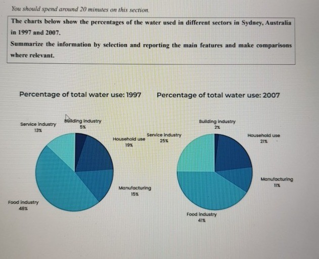
The pie chart illustrates the percentages of water used for different purposes in Sydney, Australia in 1997 and 2007.

Overall, it can be seen that the figures for all sectors witnessed a downward trend after 10 years, except for the service industry. In addition, the food industry accounted for the highest proportion in both years. 

In 1997, the largest percentage of water was used for the food industry, with 48%. This was followed by the figure for household use with nearly a fifth of the total water consumed. The percentage of service industry and manufacturing was almost identical, at 13% and 15%, respectively. It can be noticed that water was least consumed for the building industry purpose, with a minimal percentage of 5%. 

Despite a marginal drop of 7%, the food industry still dominated other sectors after a decade. At the same time, the percentage of water used for the service industry experienced a significant growth to 25%, surpassing the household use (21%) to rank second. Meanwhile, there was a slight decline in the figures for manufacturing and building industry, at 11% and 2%, respectively.

Mở khóa để xem toàn bộ nội dung trả lời

(?)
Bạn đã đạt đến giới hạn của mình. Bằng cách Đăng ký tài khoản, bạn có thể xem toàn bộ nội dung trả lời
Cải thiện điểm số của bạn bằng cách đăng ký tài khoản Lazi.
Xem toàn bộ các câu trả lời, chat trực tiếp 1:1 với đội ngũ Gia sư Lazi bằng cách Đăng ký tài khoản ngay bây giờ
Tôi đã có tài khoản? Đăng nhập

Bạn hỏi - Lazi trả lời

Bạn muốn biết điều gì?

GỬI CÂU HỎI
Học tập không giới hạn cùng học sinh cả nước và AI, sôi động, tích cực, trải nghiệm

Hôm nay bạn thế nào? Hãy nhấp vào một lựa chọn, nếu may mắn bạn sẽ được tặng 50.000 xu từ Lazi

Vui Buồn Bình thường

Học ngoại ngữ với Flashcard

×
Gia sư Lazi Gia sư
×
Trợ lý ảo Trợ lý ảo